After introducing the Jetpack Mobile app earlier this year, we’re focused on making it the best WordPress experience on your mobile device. We’ve started by updating the design of the mobile editor.
Below we walk you through the changes we’ve made that streamline your writing and editing experience on mobile. You’ll find these improvements when your app updates to version 22.9.
Fresh color palette
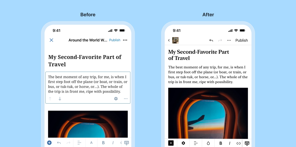
We’ve replaced soft blue tones with a striking black and white style, which not only looks cleaner but is simply easier to see as well. Overall, we’ve aligned our styles more closely to the WordPress.com desktop experience, including the more familiar block inserter button.
Cleaner top navigation
We’ve hidden the site title to make room for global actions like “Undo.” Your site icon is shown next to the back arrow, where you can tap to leave the editor. We’ve also added a border to clearly separate the navigation bar from your content.
Faster media insertion
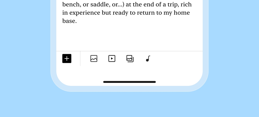
We’ve added in-line media blocks when you have no other block selected, so you can add an image or video faster without opening the full block list.
More space to write
We’ve hidden the blue border around the paragraph block while you’re typing to let you focus on writing.
Unified block controls
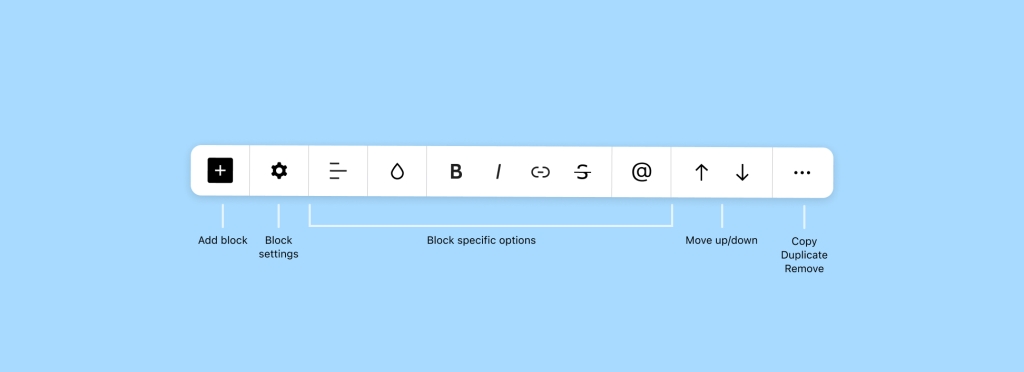
It used to be that some block controls were shown on top of the block, taking space from your content. Now all the block controls live in the toolbar, with the settings icon up first.
New ways to move blocks
The up and down arrows, which move blocks within your posts and pages, have moved to the right side of the toolbar. And if you missed it, we introduced drag and drop last year, so you can move blocks manually.
More to comeYou’ll find these improvements when your app updates to version 22.9.
We’ll be continuing to make improvements to the mobile editor. In the meantime, we’d love to hear what you like, what challenges you’ve encountered, and any ideas you have. It may very well shape what we work on next.
Get the app today


